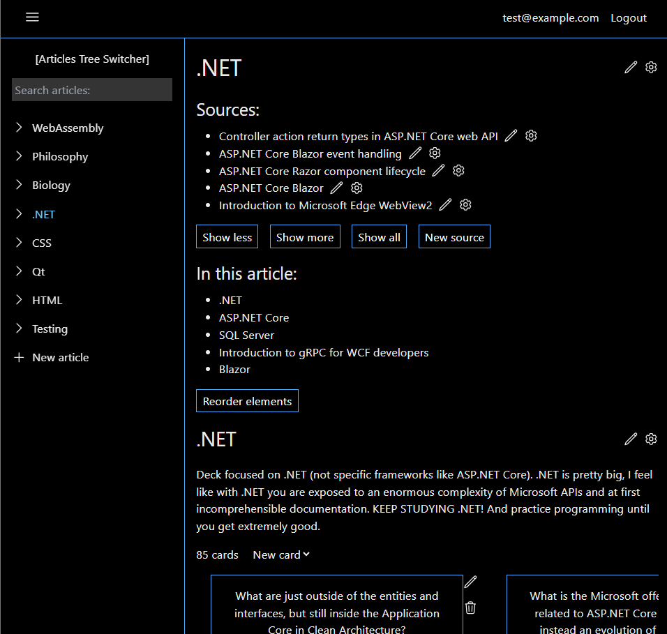
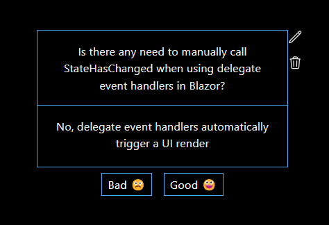
I scrapped a lot of the old color scheme and refactored to a simpler but overall better looking one. I also added some UI to the sources area of the article to keep the list shorter, and collapsible and expandable.


Possible improvements:
- Use more of the page to show the card
- Add a bottom action bar for reviewing buttons
- Deck in article should show most due cards first
- Deck in article should hide not due cards, maybe implement standard pagination features